Their color predictions for 2021 are already rolling in. See the top shades we know so far, and check back to find out all the 2021 colors of the year as they’re announced.
Pantone is the latest to reveal its prediction for the 2021 color of the year. See which shades you can expect to see in the coming year from some of the biggest names in paint.
By Jessica Bennett Updated December 09, 2020
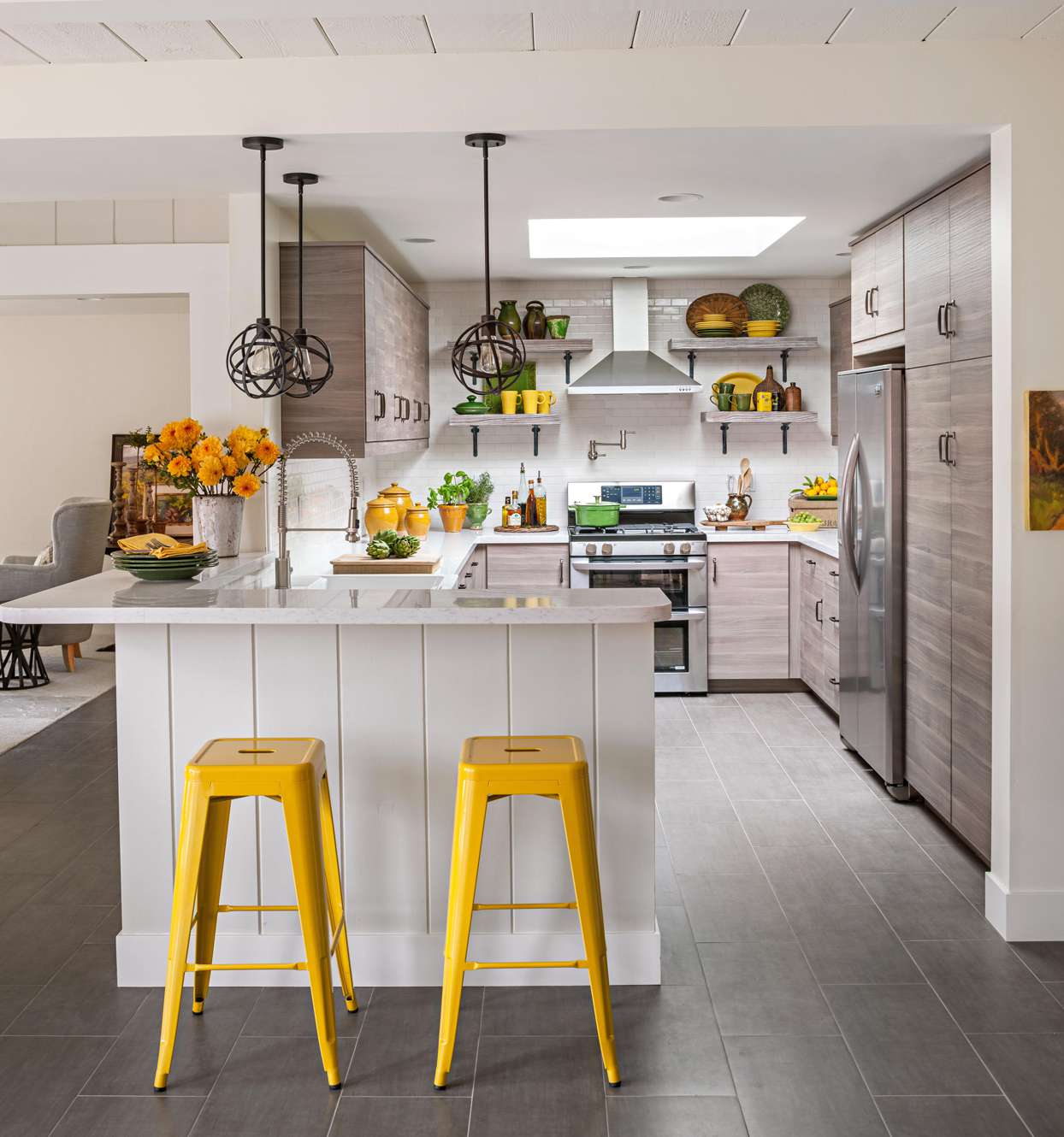
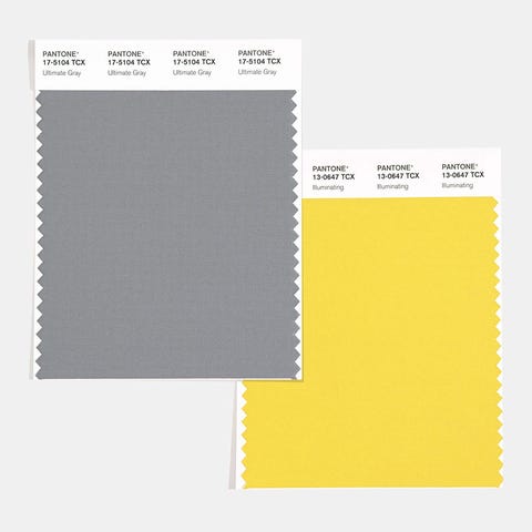
Ultimate Gray and Illuminating by Pantone
The global authority on color put a surprising spin on its highly anticipated color of the year announcement: Pantone chose two contrasting shades as its top picks for 2021. Ultimate Gray, a practical and dependable neutral, and a sunny yellow called Illuminating combine to reflect a sense of resilience and optimism as we close out a difficult year.
Perfect for painted walls or upholstered furniture, Ultimate Gray is a timeless neutral that provides a grounding foundation in interiors. Illuminating adds a dash of brightness and positivity when used on accent furniture, wall decor, accessories like pillows and throws, or even a front door. The high-contrast pairing creates an energetic look, but warm undertones tie the two colors together. It’s an ideal combination as we look forward to brighter days ahead.
CREDIT: COURTESY OF RUST-OLEUM
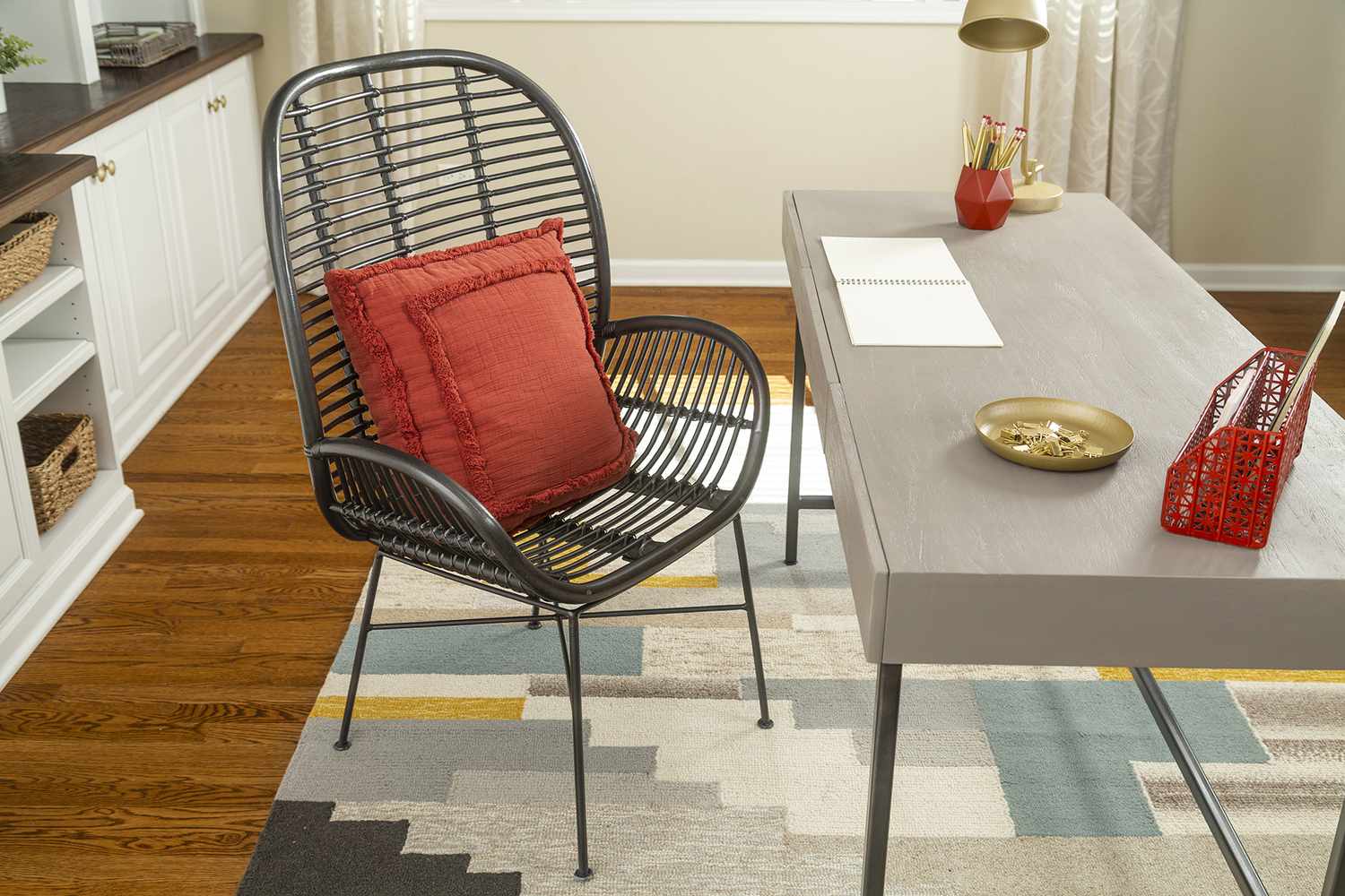
Satin Paprika by Rust-Oleum
Popular spray-paint brand Rust-Oleum named an earthy, spicy hue called Satin Paprika for its 2021 color of the year. Warm and cozy, the red color accompanies nine other trending shades the brand has selected for its Color Watch 2021. Satin Paprika anchors each of the three distinct palettes, which were curated to complement outdoor living spaces, modern boho aesthetics, and midcentury modern style.
Try spraying a few coats of Satin Paprika on accent furniture, such as a lamp base or side table, or update wall decor to add a vibrant yet comforting feel to your space. The color pairs beautifully with other earth tones as well as brass and matte black finishes.
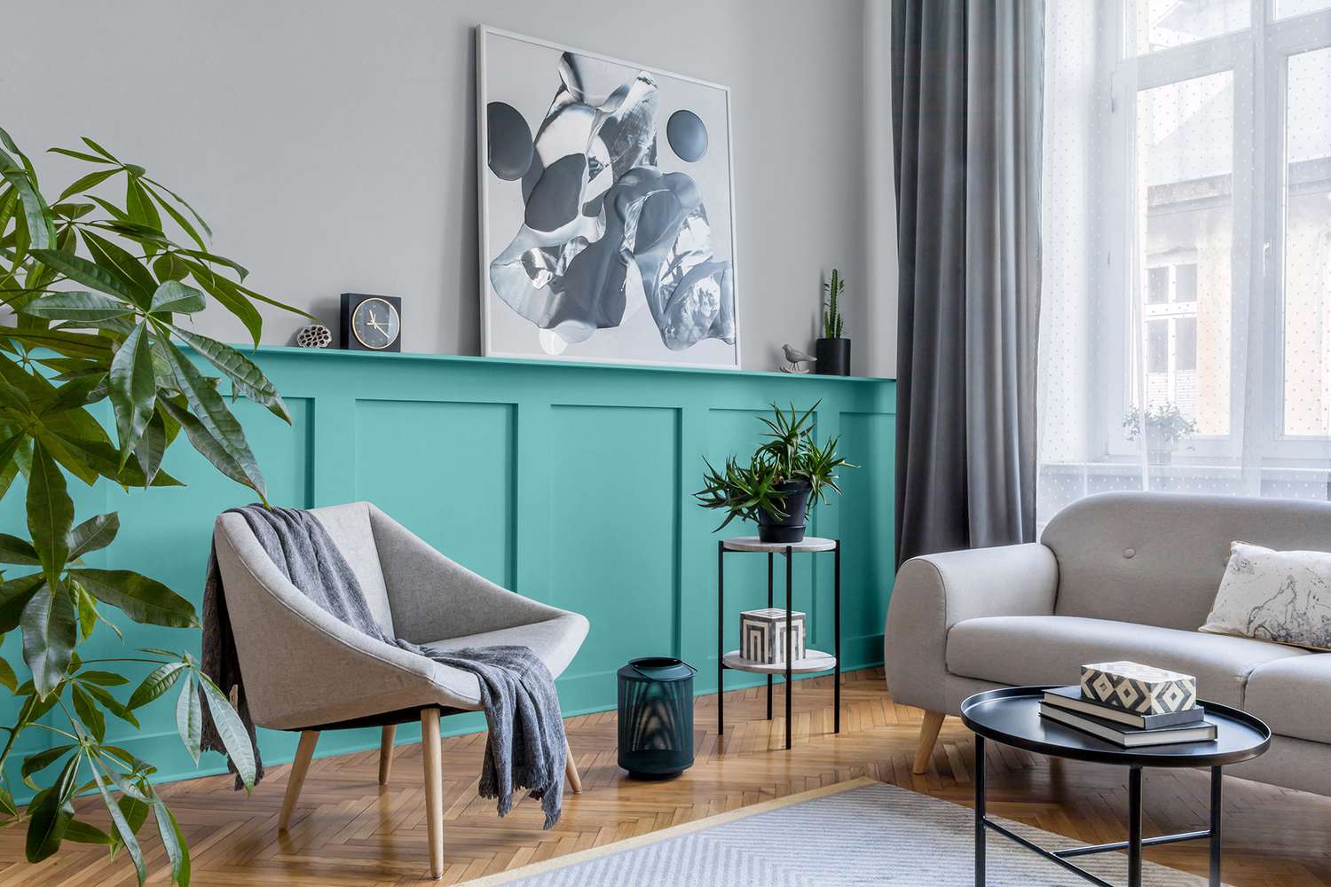
Aqua Fiesta by Glidden
This year, Glidden put a new spin on its yearly paint color prediction by announcing its first-ever accent color of the year. Aqua Fiesta PPG1147-4 is a bright, refreshing aquamarine that looks great on an accent wall or millwork. Although the vibrant blue-green might be a bit overwhelming as an all-over wall color, it makes a splash even in small doses when combined with other neutral paint colors. The brand suggests pairing Aqua Fiesta with a cool gray to create a spa-like vibe that’s perfect for bathrooms. In bedrooms or living areas, layer in cream-colored fabrics and neutral accessories to soften the color’s boldness.
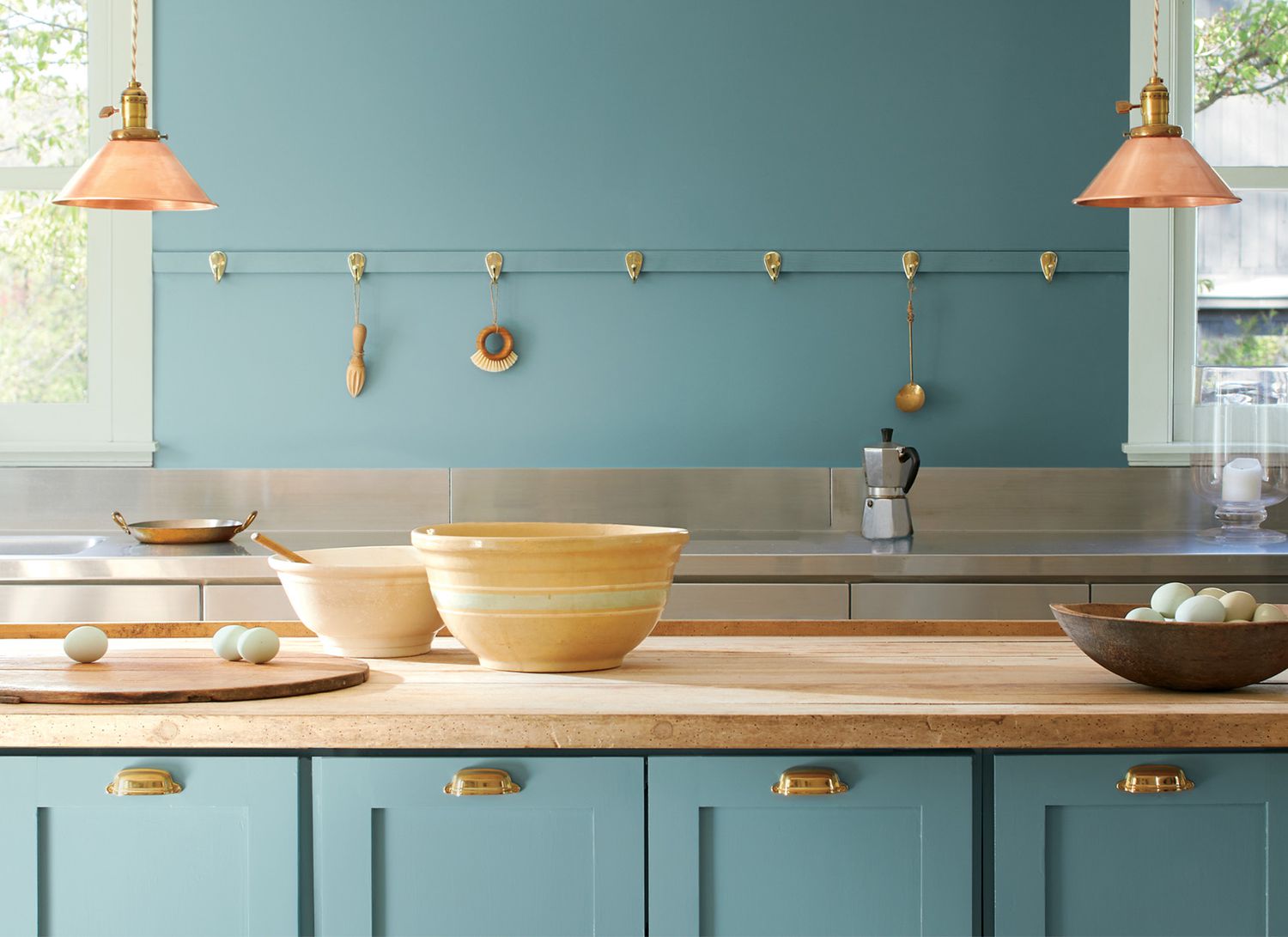
Aegean Teal by Benjamin Moore
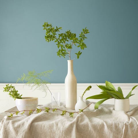
Benjamin Moore selected a soft, soothing blue-green for its 2021 color of the year. Aegean Teal 2136-40 marries the tranquil nature of blue with green’s association with wellness, while a gray undertone keeps the color modern. The color’s calming qualities make it an excellent choice for bedrooms or home offices, and its casual elegance shines on kitchen cabinetry or built-ins.
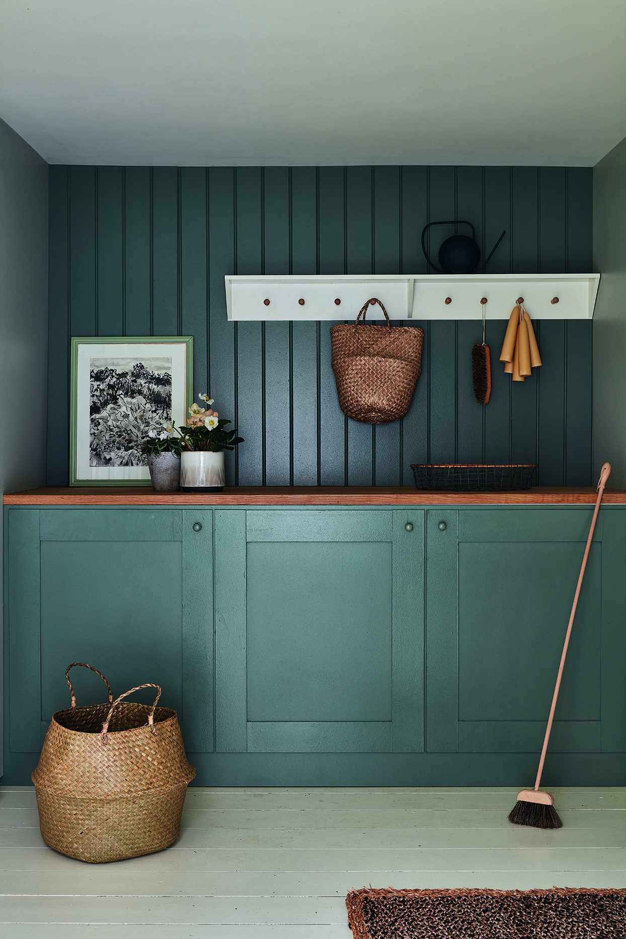
CREDIT: COURTESY OF FARROW & BALL
Farrow & Ball 2021 Colors of the Year
Divided into four distinct categories, the versatile colors combine to form timeless schemes that offer both comfort and a sense of luxury. The “Rich and Warm” collection encompasses chocolatey hues with strong red undertones, including Deep Reddish Brown, Tanner’s Brown, and Preference Red, that would work perfectly in a cozy home office or den. The company’s “Clean and Timeless Blues” features the fresh yet familiar tones of Pitch Blue, Stiffkey Blue, and Ultra Marine Blue, which create a lavish environment in bedrooms. Lush, leafy colors with gray undertones, including Green Smoke, Treron, and Sap Green, round out the “Natural Greens” palette and provide a welcoming vibe in entryways and hallways. In neutral spaces, the aged, earthy tones of Jitney, Dead Salmon, and India Yellow offer an elegant and moody alternative to white.
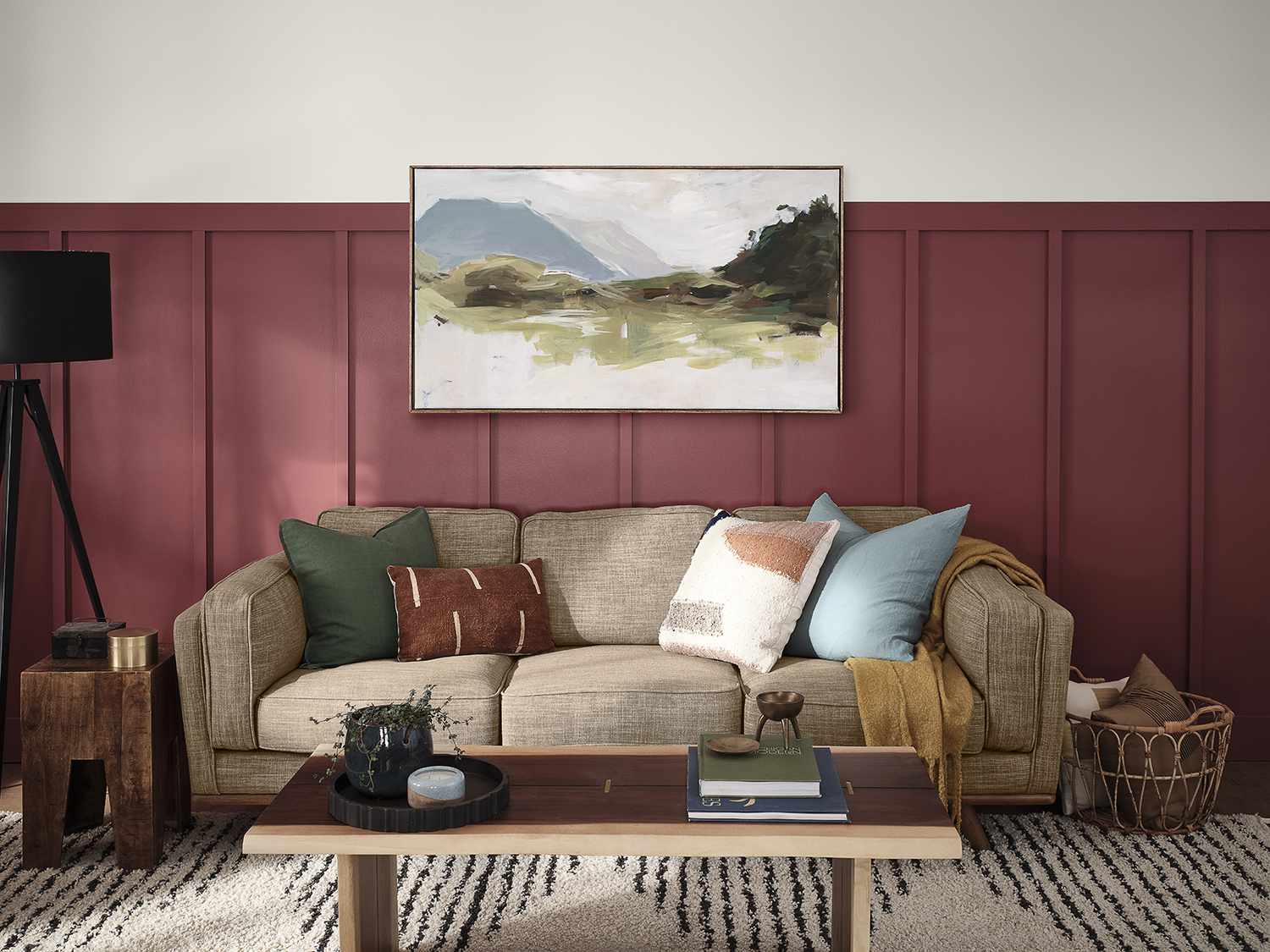
CREDIT: COURTESY OF HGTV HOME BY SHERWIN-WILLIAMS
Passionate by HGTV Home by Sherwin-Williams
HGTV Home by Sherwin-Williams predicts vibrant, daring colors will reign supreme in the coming year. The brand’s 2021 color of the year, Passionate HGSW2032, is a rich, saturated red that blurs the line between modern and traditional. The bold yet elegant hue joins nine nature-inspired shades in HGTV Home’s Delightfully Daring Color Collection, which can be found exclusively at Lowe’s.
Passionate’s deep red creates an invigorating backdrop for neutral furniture and nature-inspired accents. For a more dramatic look, try pairing it with other vivid shades from the collection, such as a classic blue called Long Horizon or the verdant green Cloverfields.
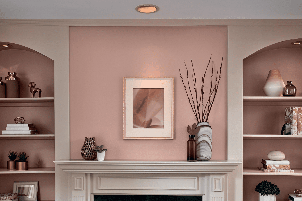
Valspar 2021 Colors of the Year
Instead of announcing a single shade for the color of the year, Valspar named 12 cozy muted colors as its top picks for 2021. Ranging in tone from misty blue to warm apricot, the hues were chosen for their ability to calm and encourage mindfulness. As more stress and time at home in 2020 coincided with a surge in DIY projects and an increased interest in meditation, this year’s selection aims to ″turn home improvement into self-improvement.”
The list of Valspar 2021 colors features a mix of versatile neutrals, including Gallery Grey, Granite Dust, Maple Leaf, Soft Candlelight, and Unforgettable. Warm, organic colors, such as Arizona Dust, Cherry Taupe, and Dusty Lavender, offer more vibrancy and warmth but still read as subtle and sophisticated. On the cooler side of the spectrum, Academy Gray, Blissful Blue, Garden Flower, and Lucy Blue are timeless, familiar greens and blues pulled straight from nature. The paint colors are all available at Lowe’s as well as many independent paint stores nationwide, though color names and shades might vary at each retailer.
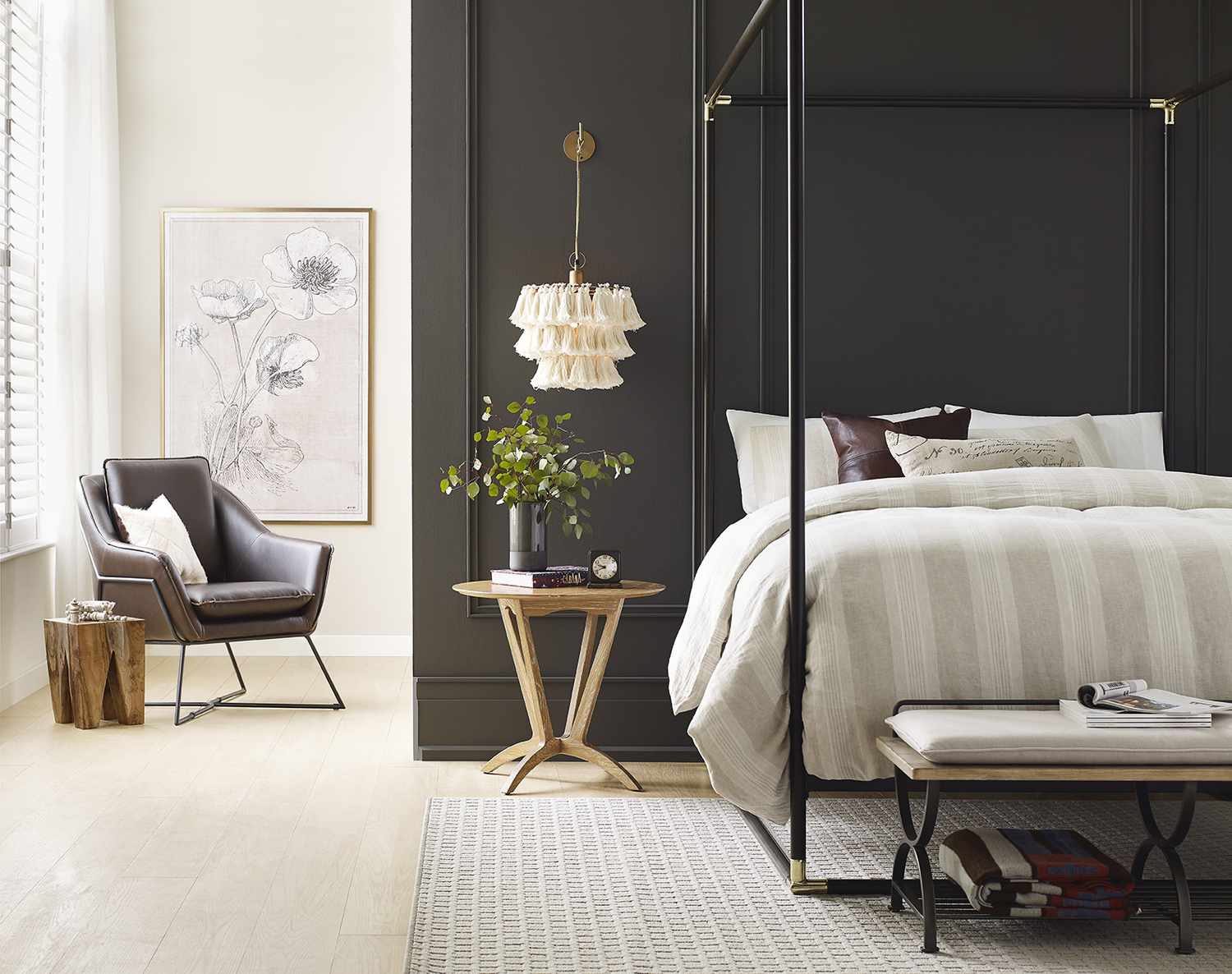
CREDIT: COURTESY OF SHERWIN-WILLIAMS
Urbane Bronze by Sherwin-Williams
Sherwin-Williams selected a rich, bold neutral as its 2021 color of the year. Inspired by nature, Urbane Bronze SW 7048 is a warm, grounding shade of gray-brown intended to reflect our current need for serenity and stability.
Gray undertones balance the earthy brown to create a dark, deeply comforting color that reminds of burnished metal or timeworn stone. Though intensely saturated, Urbane Bronze makes a subtle, sophisticated statement when used as a primary or accent color. Try it on all four walls in a bedroom or den to envelop the room in a cozy atmosphere. For a sleek, contemporary look, paint built-ins or kitchen cabinetry in Urbane Bronze, then finish the surrounding walls in a warm white to offset the darkness. The bold shade also works well in smaller doses, such as on your front door or an accent wall in the living room.
To bring out the color’s organic feel, Wadden suggests decorating with furniture made from natural materials, including wood, stone, and woven fabrics. For depth, choose accents that supply a variety of textures, such as worn leather, faux sheepskin, and aged metals. The paint color is available at Sherwin-Williams stores nationwide.
To simplify it:
- SOFT, MUTED COLORS
2. NEUTRALS PAIRED WITH BRIGHT COLORS
3. CLASSIC NEUTRALS
4. MOODY NEUTRALS
5. PALE OCHER IS THE NEW NEUTRAL


